Creating “Absolute Certainty” in the First 3 Seconds of a Landing Page
Direct Answer: A landing page creates absolute certainty in the first 3 seconds when the visitor instantly understands where they are, what they get, why it matters, who it is for, why they can trust it, and what to do next. Therefore, the hero section must match the ad, state the outcome clearly, show proof quickly, reduce risk, and make the CTA obvious before the visitor scrolls.
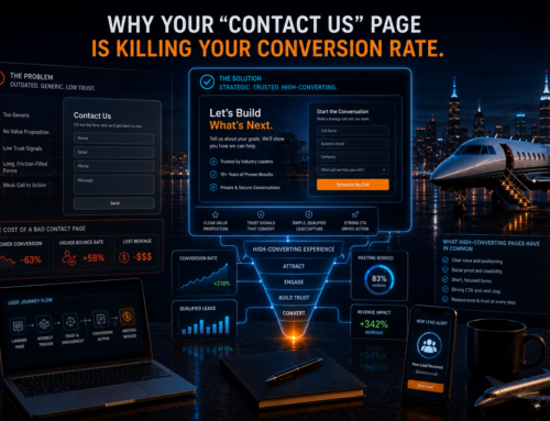
Most landing pages lose leads because they create doubt too early. The visitor clicks an ad with one expectation, then lands on a vague headline, generic stock image, weak proof, and unclear CTA. As a result, the brain asks, “Is this for me?” and the lead disappears.
However, high-ticket buyers need even more certainty. They do not want hype. Instead, they want clarity, authority, speed, relevance, and a safe next step. Therefore, the first screen must remove confusion faster than competitors create it.
Google defines landing page experience around relevance, usefulness, ease of navigation, and meeting expectations from the clicked ad creative. Additionally, Google’s landing page reporting helps advertisers evaluate the pages they send traffic to. Therefore, the first 3 seconds should align ad promise, page message, user intent, and conversion path immediately. Google explains landing page experience and Google explains landing page performance reporting.
Key Takeaways
- Landing page certainty starts before the scroll.
- However, clarity beats cleverness in the hero section.
- Therefore, the headline must match the ad and promise a specific outcome.
- Additionally, proof, risk reduction, and CTA clarity must appear immediately.
- Ultimately, the first 3 seconds decide whether the visitor trusts the page enough to continue.
What Is Landing Page Certainty?
Direct Answer: Landing page certainty is the visitor’s immediate confidence that the page matches their intent, solves their problem, and offers a safe next step.
Certainty does not mean overpromising. Instead, it means removing confusion. Therefore, the page should quickly answer six questions:
- Am I in the right place?
- Is this for someone like me?
- What outcome can I get?
- Why should I trust this company?
- What happens if I click?
- What should I do next?
Additionally, certainty should appear visually and verbally. The headline, image, proof, CTA, and layout must all say the same thing. As a result, the visitor feels oriented immediately.
Why the First 3 Seconds Matter
Direct Answer: The first 3 seconds matter because visitors decide almost instantly whether the page matches their expectation.
After a paid click, the user expects continuity. Therefore, the landing page must feel like the natural next step from the ad. If the ad promised a route review, the page should not open with a generic company introduction. Instead, it should confirm the route review immediately.
Additionally, mobile visitors scan quickly. If the page loads slowly, hides the CTA, or uses vague copy, the lead may leave before the offer is understood. Google describes landing page experience as an estimate of how relevant and useful a page is to someone who clicks an ad. Therefore, instant relevance matters. Google discusses mobile landing page experience.
Proof Breadcrumb: ad promise → page match → instant clarity → reduced doubt → higher conversion intent.
The Absolute Certainty Formula
Direct Answer: Absolute certainty comes from message match, outcome clarity, proof, risk reduction, and CTA visibility.
Use this formula:
Landing Page Certainty = Message Match × Outcome Clarity × Proof × Risk Reduction × CTA Visibility
First, message match confirms the visitor clicked the right thing. Next, outcome clarity explains what they get. Additionally, proof shows why they should believe you. Then, risk reduction makes the next step feel safe. Finally, CTA visibility tells them exactly what to do.
Therefore, a landing page does not need to be flashy. It needs to be certain.
Step 1: Write a Headline That Confirms the Click
Direct Answer: The headline should repeat or closely match the promise that made the person click.
If the ad says “Request a Private Route Review,” the landing page headline should say “Request a Private Route Review,” not “Luxury Aviation Solutions.” Therefore, the visitor feels immediate alignment.
Strong Headline Patterns
- Get [Specific Outcome] Without [Main Friction]
- Request a [Specific Review] for [Specific Buyer]
- Compare [Option A] vs [Option B] Before You Decide
- Find the Right [Service/Product] for [Specific Mission]
- Build a [Desired System] That Creates [Business Outcome]
Action Step: Build one landing page headline for each major ad promise. Do not force multiple campaigns onto one generic headline.
Step 2: Use the Subheadline to Explain the Outcome
Direct Answer: The subheadline should explain who the offer is for, what happens next, and why the action is valuable.
The headline gets attention. However, the subheadline creates understanding. Therefore, it should clarify the value without becoming long or fluffy.
Subheadline Formula
For [specific audience], we help you [specific outcome] by [specific process] so you can [desired result].
Example
For private aviation buyers, we review your route, aircraft fit, airport options, and timing so you can choose a charter option with more confidence.
Additionally, the subheadline should stay short enough to read quickly on mobile.
Step 3: Add Proof Above the Fold
Direct Answer: Proof above the fold gives visitors a reason to trust the page before they scroll.
Without proof, the landing page asks for trust too early. Therefore, add a quick credibility signal near the hero section.
Above-the-Fold Proof Options
- case study stat
- review snippet
- client logo row
- years in business
- number of leads generated
- service area credibility
- press mention
- industry certification
- process guarantee
- short trust statement
However, never fabricate proof. If verified data is unavailable, use process proof instead. For example, explain your review process, response time, or qualification method. As a result, the page still builds confidence.
Step 4: Use Visuals That Reinforce the Offer
Direct Answer: The hero visual should make the offer easier to understand, not just make the page look attractive.
Many landing pages use generic images. However, generic visuals can weaken certainty. Therefore, use visuals that match the offer.
Better Visual Examples
- route map for route review offers
- aircraft comparison chart for aviation offers
- dashboard screenshot for CRM offers
- before-and-after image for home service offers
- advisor video thumbnail for high-ticket offers
- process diagram for complex service offers
Additionally, avoid clutter. The visual should support the headline, not compete with it.
Step 5: Make the CTA Obvious and Low-Risk
Direct Answer: The CTA should tell the visitor exactly what happens when they click.
Generic CTAs like “Submit” or “Learn More” create uncertainty. Therefore, use action-specific CTA text.
Stronger CTA Examples
- Request My Route Review
- Compare My Options
- Get My Free Strategy Review
- Check Availability
- Book My Private Consultation
- Review My Lead System
Additionally, place a short risk-reduction line near the CTA. For example:
- No pressure. Just clear next steps.
- Free review. No obligation.
- Private consultation. Fast response.
- Get clarity before you decide.
As a result, the visitor understands the action and feels safer taking it.
Step 6: Remove Doubt Before It Forms
Direct Answer: The hero section should answer the visitor’s first objections before they become reasons to leave.
Common doubts include:
- Will this take too long?
- Is this actually for me?
- Will someone pressure me?
- Can I trust this company?
- What happens after I submit?
- Is this worth my time?
Therefore, add microcopy that removes these doubts quickly. For example, say “Takes less than 60 seconds,” “No obligation,” or “Advisor will review your details before calling.”
Additionally, use bullets instead of long paragraphs in the hero. As a result, visitors scan faster.
Step 7: Build the First Screen for Mobile
Direct Answer: Mobile visitors should see the headline, benefit, proof, and CTA without hunting for them.
Many landing pages look strong on desktop but fail on mobile. Therefore, test the first screen on a phone before launching ads.
Mobile Hero Requirements
- headline visible immediately
- short subheadline
- CTA visible without excessive scrolling
- proof line near the CTA
- fast-loading image or video
- simple form or button
- no cluttered menus
- no distracting popups
Additionally, Google has emphasized relevant content and easy-to-navigate landing pages for ads. Therefore, mobile clarity and navigation matter for both users and ad performance. Google discusses landing page navigation for search ads.
First-3-Second Hero Templates
Direct Answer: A strong hero section follows a clear pattern that removes doubt quickly.
Template 1: High-Ticket Service
Headline: Get a Clear [Outcome] Plan Before You Spend Another Dollar
Subheadline: We review your current system, identify the biggest revenue leaks, and show you the fastest path to better qualified leads.
Proof: Built for high-ticket service businesses that need quality, not lead volume.
CTA: Book My Free Strategy Review
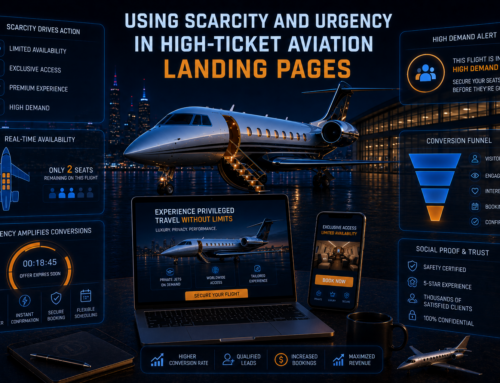
Template 2: Aviation Route Review
Headline: Request a Private Route Review Before You Charter
Subheadline: Compare aircraft fit, airport options, timing, passenger needs, and pricing variables before choosing your next flight.
Proof: Advisor-led review. Private follow-up. No pressure.
CTA: Request My Route Review
Template 3: Paid Ads Audit
Headline: Find Out Why Your Paid Ads Are Producing Low-Quality Leads
Subheadline: We review your targeting, creative, landing page, form, and CRM follow-up to find the leaks hurting lead quality.
Proof: Built for businesses spending serious money on paid acquisition.
CTA: Get My Ad Funnel Review
Before and After Examples
Direct Answer: Landing pages improve when the hero moves from vague branding to specific certainty.
Bad Example
Headline: Premium Marketing Solutions for Growing Businesses
Problem: This headline says nothing specific. Therefore, the visitor must work too hard to understand the offer.
Better Example
Headline: Get a 15-Minute Lead Quality Audit Before Scaling Your Ads
Why It Works: The visitor understands the action, timeframe, and outcome immediately.
Bad Example
Headline: Luxury Private Jet Charter Services
Problem: This headline sounds like every competitor.
Better Example
Headline: Compare Aircraft Options for Your Palm Beach to London Flight
Why It Works: The headline matches a specific mission and signals expert guidance.
Landing Page Certainty Checklist
Direct Answer: Use this checklist before sending paid traffic to any landing page.
- Does the headline match the ad promise?
- Can a visitor understand the offer in 3 seconds?
- Does the page state a specific outcome?
- Does it show proof above the fold?
- Does the CTA explain what happens next?
- Does the hero reduce risk?
- Does the visual support the offer?
- Does the mobile view show the CTA quickly?
- Does the form ask only necessary questions?
- Does the page explain who the offer is for?
- Does the page avoid vague brand language?
- Does it load quickly enough for mobile visitors?
Therefore, do not launch the page until the first screen passes every item.
Metrics That Matter
Direct Answer: Measure landing page certainty by conversion quality, not only traffic volume.
Track These Metrics
- landing page view rate
- bounce rate
- scroll depth
- CTA click rate
- form start rate
- form completion rate
- cost per qualified lead
- lead-to-call rate
- booked call rate
- sales qualification rate
- page speed
- mobile conversion rate
Additionally, Google Ads allows advertisers to evaluate landing page URL performance. Therefore, review page-level results, not only campaign-level averages. Google explains landing page performance reports.
Common Landing Page Mistakes
Direct Answer: Landing pages fail when they make visitors think too hard too early.
- using vague headlines
- not matching the ad promise
- hiding proof below the fold
- using generic stock images
- using weak CTAs like “Submit”
- asking too many form questions too soon
- not explaining what happens after the click
- loading slowly on mobile
- using distracting navigation
- leading with company history instead of buyer outcome
- burying the offer
- not showing risk reduction
Instead, make the visitor feel oriented immediately. Therefore, every hero element should reduce uncertainty.
Frequently Asked Questions
What should a landing page show in the first 3 seconds?
It should show a clear headline, specific outcome, proof or trust cue, obvious CTA, and a short explanation of what happens next.
Why do landing pages lose leads quickly?
They lose leads because the message does not match the ad, the offer feels vague, proof is missing, or the CTA creates uncertainty.
What is message match?
Message match means the landing page repeats or closely mirrors the ad promise so visitors instantly know they are in the right place.
Should proof appear above the fold?
Yes. Proof above the fold helps visitors trust the offer before they scroll or submit a form.
What is the best CTA for a high-ticket landing page?
The best CTA states the exact next step, such as Book My Strategy Review, Request My Route Review, Compare My Options, or Check Availability.
External Sources
Conclusion
Direct Answer: Absolute certainty in the first 3 seconds comes from message match, outcome clarity, proof, risk reduction, and CTA visibility.
Your landing page should not make visitors decode the offer. Instead, it should immediately confirm their click, explain the value, prove credibility, and show the safest next step. Therefore, the hero section must act like a conversion filter, not a design decoration.
Final Insight: A visitor does not convert when they understand everything. They convert when they feel certain enough to take the next step.
About the author : Anthony Paulino